Geoglyphs of Southeast Baltimore
May 2, 2012
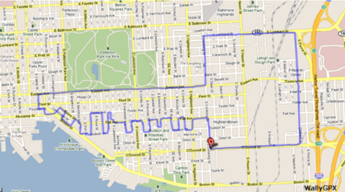
 Here we see The Superconductor, a GPS track created a couple of months ago by Michael J. Wallace as he navigated his bicycle through the streets of Baltimore.
The track is invisible out on the street, of course; it comes to us as a digital recording (via a GPS app on a cellphone) of the exact path taken by Wallace's bicycle during one of his fitness rides. He designs a different track for each ride, planning it out ahead of time on maps and satellite imagery and then following the route as precisely as possible, even if he has to go the wrong way down a one-way street or retrace part of his path without moving over to the other side of the street.
"Once the recording begins," he says on his website, "a continuous pedal-powered line is created." The line becomes visible only when he gets back home after the ride and checks it out on his computer screen. It's a "virtual geoglyph," he says, painted in sweat on the "local canvas" of his neighborhood.
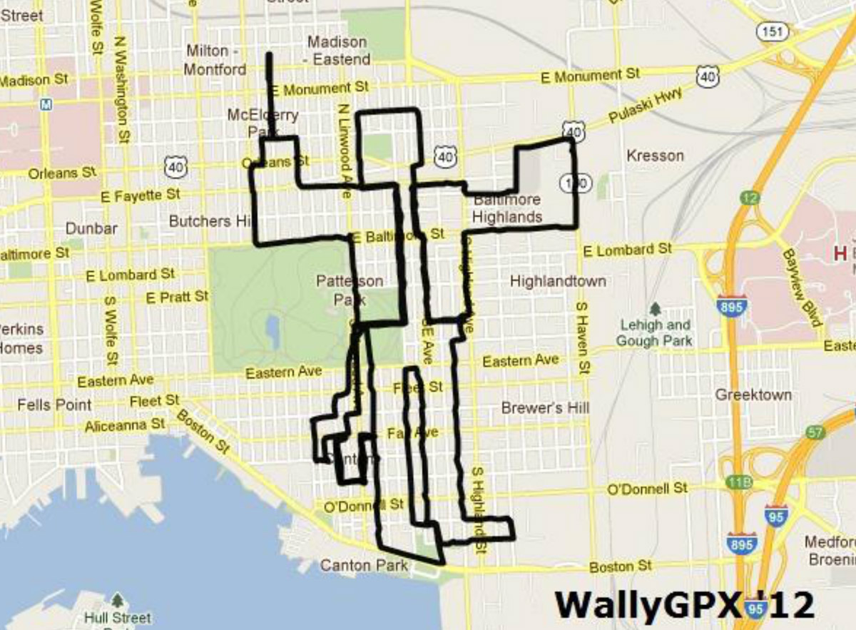
The geoglyph below, of a Baltimore icon, the Francis Scott key, required 6.25 miles of pedaling on a wretchedly muggy night last summer, when the temperature was 87 degrees. Wallace started the ride listening to Clash in his headphones but soon switched to the Rolling Stones. Tracing the key took 53 minutes and 17 seconds, and along the way he noticed four dead rats in the street and one dead bird.
When he got to the upper righthand corner of the key, the street he was following northward dead ended at the bottom of an embankment. "I had to muscle my bike up a steep hill to catch E. Lombard Street back towards downtown," he noted. "Sometimes that's how the road goes."